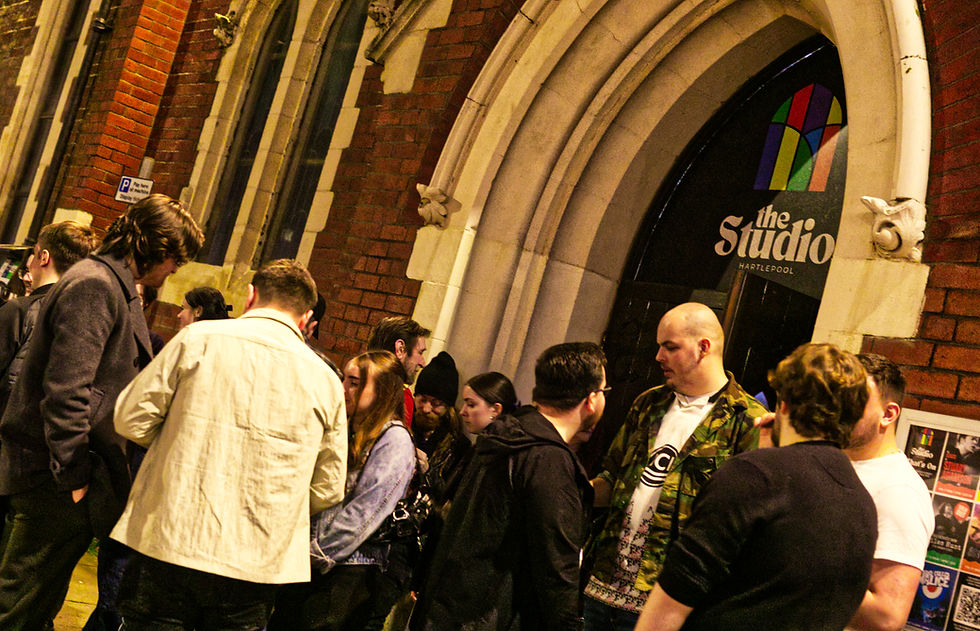
New Branding Launched to Celebrate 25 years.
- info801857
- Apr 16, 2023
- 2 min read
Hartlepool Community Studio, also known as "The Studio," has been the town's only purpose-built music venue for 25 years and is celebrating this milestone in 2023.
As part of the Studio's commemoration, I have been undertaking a complete rebranding effort, starting with a new logo and logotype.

Over its long history, The Studio has had only five logos, and while the current logo has served us well for the past eight years, it no longer reflects our vision for the future.
The new logo celebrates The Studio's vibrant and dynamic arts and music community, drawing inspiration from the abstract stained-glass windows of the building, with their primary and tertiary colours, and simplified its design into an arched window graphic with bold outlines. Each panel of the window is filled with different colours, creating a bright and dynamic visual effect that captures the essence of The Studio's artistic/creative spirit.
Created by Chair of Trustees, Brian Barnes, said, “I wanted something unique and visually appealing. I chose a typeface with rounded serifs and also that had a retro feel, and is easy on the eyes, making it comfortable to read, and highlight the name "Hartlepool" in a more formal way too.”
“The combination of the icon and the logotype creates a versatile brand identity making it an ideal fit for The Studio's new brand. It will be used across all our social media channels and can be applied to a wide range of media, including signage, t-shirts, mugs, and other promotional materials,” added Brian.
The new logo should be the catalyst for a new brand that will highlight the significant changes The Studio team have made in recent months and reflects their visions and aims for the future for the venue and community.
Take a moment to watch the short video the evolution of The Studio logo below:


Comments